Google Search Tests New Product Carousels
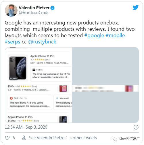
Google is testing new user interfaces, designs and layouts for the product one box and product boxes. Valentin Pletzer shared a couple of these designs on Twitter and I am able to replicate one of these. Google正在测试产品一盒和产品盒的新用户界面,设计和布局。Valentin Pletzer在Twitter上分享了其中一些设计,我能够复制其中一个。
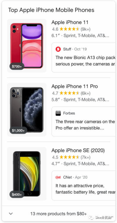
If you do a search for [iPhones] on mobile, I got this "Top Apple iPhone Mobile Phones" section, that shows a large image on the left, with a price on the bottom left corner of the image and then product details at the top right, followed by a carousel of reviews on the bottom right. 如果您在移动设备上搜索[iPhone],则会看到“顶部Apple iPhone手机”部分,该部分在左侧显示一个大图像,在图像的左下角显示一个价格,然后在屏幕上显示产品详细信息 右上角,然后是右下角的轮播评论。
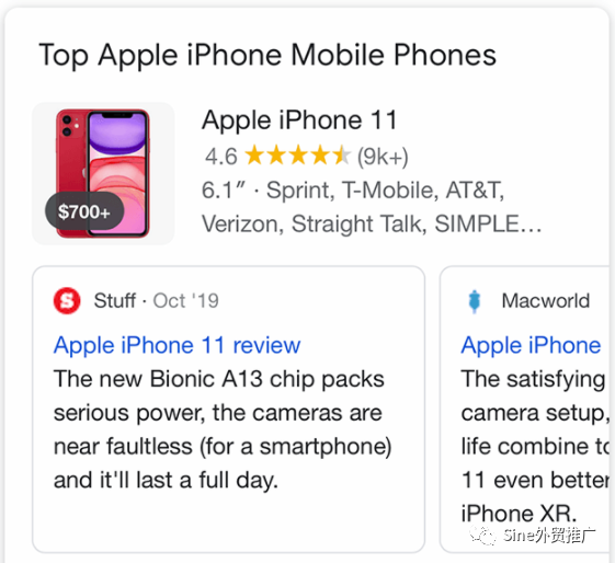
If you scroll those reviews, the image gets smaller and the reviews then slide to the left:
Valentin noticed variations to this design as well:

Forum discussion at Twitter.
文章为作者独立观点,不代表DLZ123立场。如有侵权,请联系我们。( 版权为作者所有,如需转载,请联系作者 )

网站运营至今,离不开小伙伴们的支持。 为了给小伙伴们提供一个互相交流的平台和资源的对接,特地开通了独立站交流群。
群里有不少运营大神,不时会分享一些运营技巧,更有一些资源收藏爱好者不时分享一些优质的学习资料。
现在可以扫码进群,备注【加群】。 ( 群完全免费,不广告不卖课!)


发表评论 取消回复